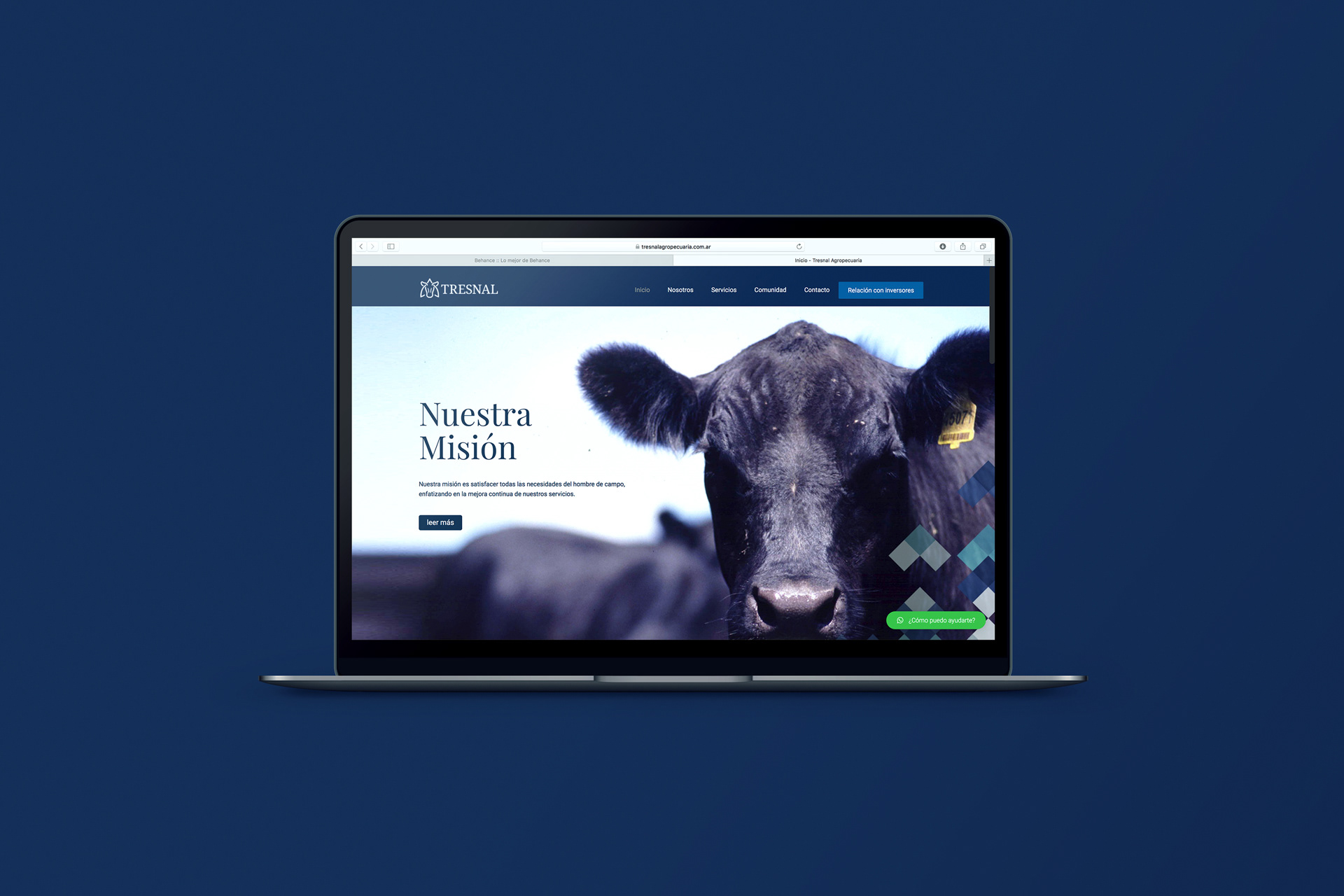

We designed the logo and branding for Tresnal Agropecuaria, a company based in the 25 de Mayo, Buenos Aires, Argentina, which, with a great team of collaborators, has become an important driver of economic and social development in the region.
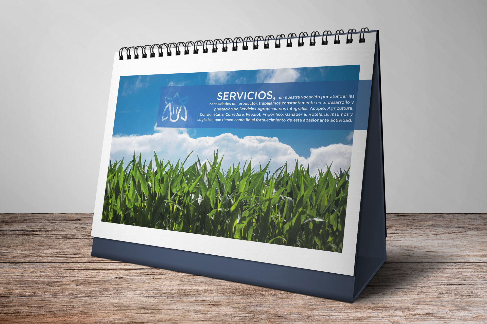
Tresnal is committed to strengthening agricultural activity and works on the development and provision of comprehensive agricultural services to meet the needs of producers.
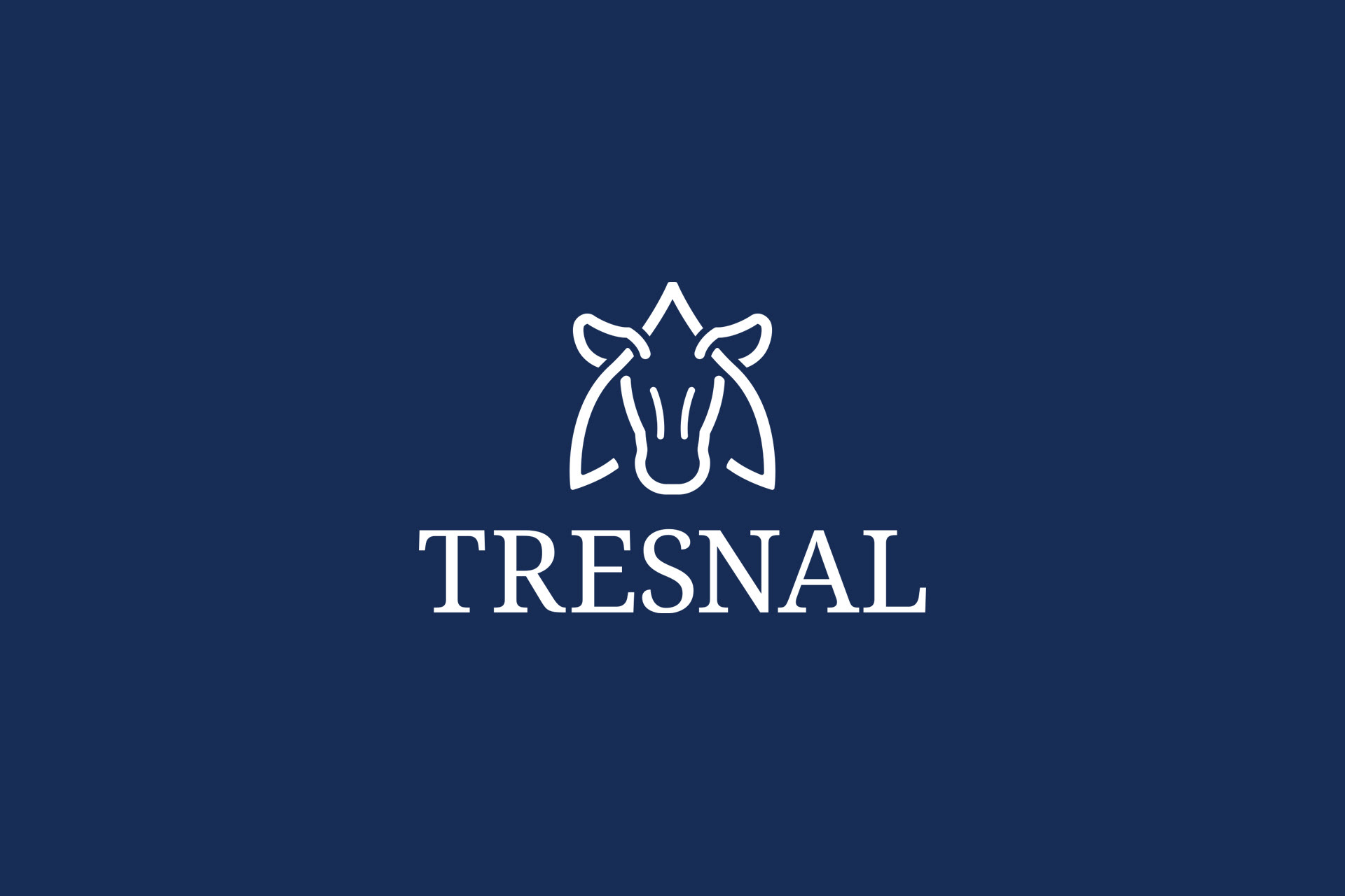
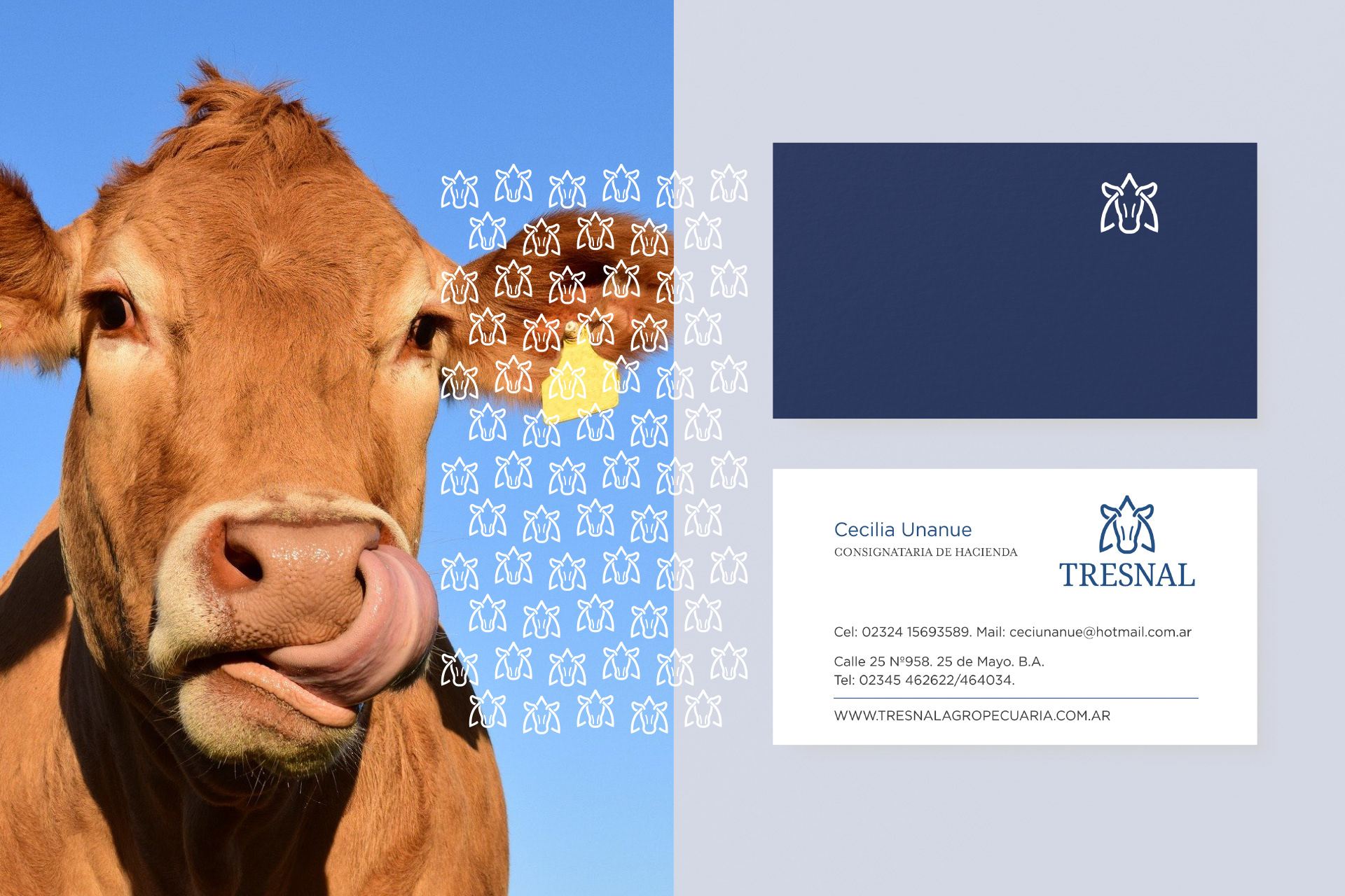
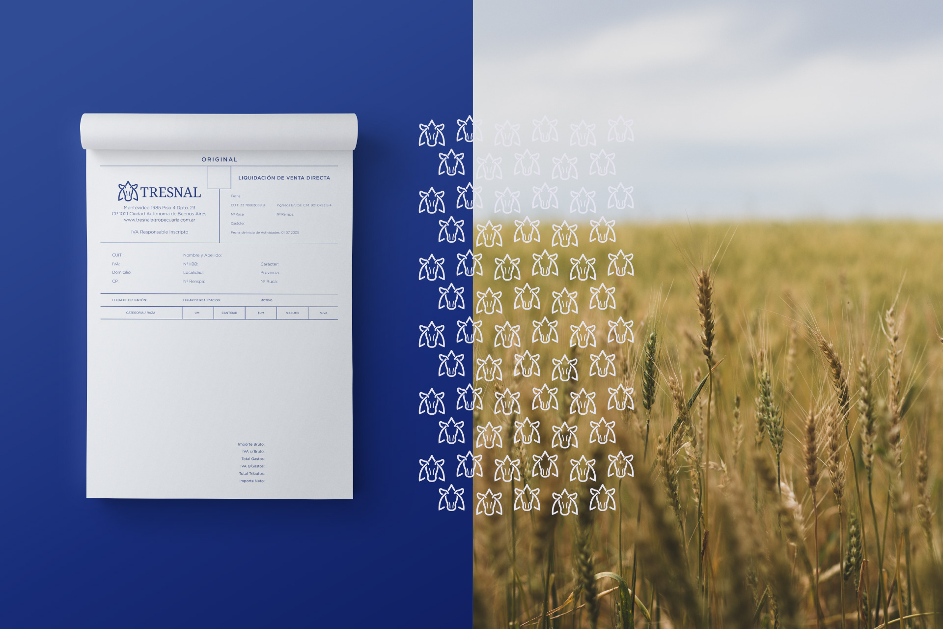
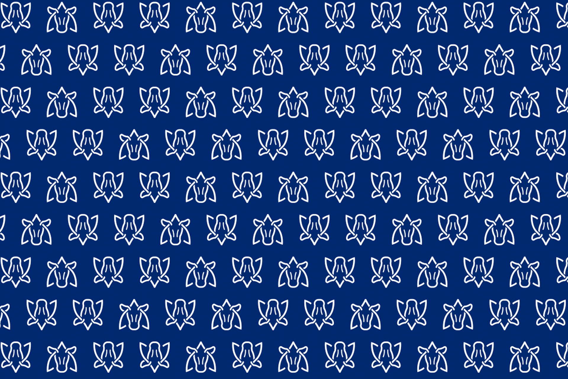
The logo we designed represents the essence of the company, featuring the shape of a cow's head intertwined with a Tresnal, bundles of harvested grain. The cow symbolizes the countryside, while the tresnal reinforces the connection with the rural and agricultural environment, creating a distinctive and meaningful image, reminiscent of the characteristic hot branding irons used in the field.
We have chosen the color blue for the logo, as it conveys trust, professionalism, and calmness. The simple and strong lines of the design give it a modern and memorable appearance.
The logo of Tresnal Agropecuaria is more than just an image. It represents dedication to agricultural activity, a commitment to quality, and the desire to establish a strong identity in the market. It is a symbol that distinguishes and helps convey the message to clients and collaborators.